If you are like me, when you see an impressive demo of a new CSS3 feature, you can’t wait to start using it in websites. Of course, then you see that it is available in only one or two of the major browsers (and this never includes IE), so ultimately you decide to wait. I have good news for you – with the latest browser releases, there are a few awesome features that are finally supported everywhere, and you can start using them right now!
A word of caution – most of these features will not work in older versions of IE (9 and below). If these browsers are a large portion of your demographic, I am afraid that you will have to rely on fallbacks. But for the rest of us, here is what modern browsers have to offer:
1. CSS Animations and Transitions
CSS animations are finally available in all major browsers, even in IE (since version 10). There are two ways to create CSS animations. The first is very easy, it is done through animating the changes of CSS properties with the transition declaration. With transitions, you can create hover or mouse down effects, or you can trigger the animation by changing the style of an element with JavaScript. You can see the transition below by hovering over the planet – this will cause the rocket to close in.
The second way for defining animations is a bit more complicated – it involves the description of specific moments of the animation with the code>@keyframe rule. This allows you to have repeating animations that don’t depend on user actions or JavaScript to get triggered.
HTML:-
1 2 3 4 | <div class="container"> <div class="planet"></div> <div class="rocket"></div> </div> |
CSS:-
1 2 3 4 5 6 7 8 9 10 11 12 13 14 15 16 17 18 19 20 21 22 23 24 25 26 27 28 29 30 31 32 33 34 35 36 37 38 39 40 41 42 43 44 45 46 47 48 49 50 51 52 53 54 55 56 57 58 59 60 61 | .container{ width: 300px; height:300px; margin: 0 auto; position:relative; overflow:hidden; } .planet{ position:absolute; top:0; left:0; width:100%; height:100%; background:url(https://demo.tutorialzine.com/2013/10/css3-features-you-can-finally-use/assets/img/planet.png) no-repeat center center; } .rocket{ position:absolute; top:0; left:0; width:100%; height:100%; background:url(https://demo.tutorialzine.com/2013/10/css3-features-you-can-finally-use/assets/img/rocket.png) no-repeat 50px center; /* Chrome still requires the -webkit- prefix */ -webkit-animation:orbit 2s linear infinite; animation:orbit 2s linear infinite; transition:background-position 0.8s; } .container:hover .rocket{ background-position:80px center; } /* Define the keyframes of the animation */ @-webkit-keyframes orbit { from { -webkit-transform:rotate(0deg);} to { -webkit-transform:rotate(360deg); } } @keyframes orbit { from { transform:rotate(0deg); /* I am including the -webkit-transform properties, because Chrome might start supporting keyframe without prefix in the future, but we can't be certain whether it will support prefix-free transform at the same time */ -webkit-transform:rotate(0deg);} to { transform:rotate(360deg); -webkit-transform:rotate(360deg); } } |
2. Calculating Values With calc()
Another new and awesome CSS feature is the calc() function. It allows you to do simple arithmetic calculations in CSS. You can use it anywhere a length or a size is required. What is even cooler, is that you can freely mix different units, like percentages and pixels. This makes a lot of layout hacks that you might have used in the past obsolete. The best news? It works in IE9 and up, prefix-free.
HTML:-
1 2 3 | <div class="container"> <p>This div has 20px on either side.</p> </div> |
CSS:-
1 2 3 4 5 6 7 8 9 10 11 | .container{ /* Calculate the width */ width: calc(100% - 40px); background-color:#CDEBC4; color:#6D8B64; text-align:center; padding:25px 0; margin: 0 auto; } |
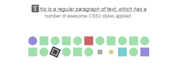
3. Advanced Selectors
These days, if you assign IDs to elements only so you can style them, you are probably doing it wrong. CSS 2.1 and CSS 3 introduced a number of powerful selectors that can make your layouts cleaner, and your stylesheets more awesome.
These are supported in all major browsers including IE9 and up.
HTML:-
1 2 3 4 5 6 7 8 9 10 11 12 13 14 15 16 17 18 19 20 21 22 23 24 25 26 | <p>This is a regular paragraph of text, which has a number of awesome CSS3 styles applied..</p> <div class="container"> <div class="elem"></div> <div class="elem"></div> <div class="elem"></div> <div class="elem"></div> <div class="elem"></div> <div class="elem"></div> <div class="elem"></div> <div class="elem"></div> <div class="elem"></div> <div class="elem"></div> <div class="elem"></div> <div class="elem"></div> <div class="elem"></div> <div class="elem"><span></span></div> <div class="elem"></div> <div class="elem"></div> <div class="elem"></div> <div class="elem" data-foo="bar1"></div> <div class="elem" data-foo="bar2"></div> <div class="elem"></div> <div class="elem"></div> <div class="elem"></div> </div> |
CSS:-
1 2 3 4 5 6 7 8 9 10 11 12 13 14 15 16 17 18 19 20 21 22 23 24 25 26 27 28 29 30 31 32 33 34 35 36 37 38 39 40 41 42 43 44 45 46 47 48 49 50 51 52 53 54 55 56 57 58 59 60 61 62 63 64 65 66 67 68 69 70 71 72 73 74 75 76 77 78 79 80 81 82 83 84 85 86 87 88 89 90 91 92 93 94 95 96 97 98 99 100 101 102 103 104 105 106 107 108 | /* Style the elements (nothing interesting here) */ p{ font-size: 16px; width: 420px; margin: 20px auto 0; text-align:center; } .container{ width: 420px; margin:50px auto 0; overflow: hidden; padding:5px; } .elem{ width:30px; height:30px; margin:4px; background-color:#A0DFAC; float:left; } .elem span{ position:absolute; top:5px; left:5px; right:5px; bottom:5px; border:2px solid #fff; } /* Selectors for matching the first letter and line: */ p::first-letter{ background-color: #666; color: #FFF; font-size: 24px; font-style:normal; display: inline-block; padding: 0 5px; border-radius: 3px; margin-right: 2px; font-family: serif; } p::first-line{ font-size: 18px; text-transform: smallcaps; font-style: italic; text-decoration: underline; } /* Make the first and last elements purple */ .elem:first-child, .elem:last-child{ background-color:#948bd8; } /* Make every other element rounded */ .elem:nth-child(odd){ border-radius:50%; } /* Make the sixth element red */ .elem:nth-child(6){ background-color:#cb6364; } /* Style the element which contains the span */ .elem:not(:empty){ background-color:#444; position:relative; -webkit-transform:rotate(25deg); transform:rotate(25deg); } /* Target elements by attribute */ .elem[data-foo=bar1]{ background-color:#aaa; } .elem[data-foo=bar2]{ background-color:#d7cb89; } /* The attribute value should start with bar. This matches both of the above elements */ .elem[data-foo^=bar]{ width: 16px; height: 16px; margin: 11px; } /* The element that follows after the one with data-foo="bar2" attribute */ .elem[data-foo=bar2] + .elem{ background-color:#78ccd2; } |
4. Generated Content and Counters
Generated content is a powerful tool in the hands of developers, made available by the ::before and ::afterpseudo elements. This feature lets you use less HTML to achieve the same layouts. This is especially beneficial in cases where you need extra box shadows or other visual elements that would require extra spans or divs. In the end, you get a more minimal and semantically correct HTML.
CSS3 also gives pseudo elements access to counters, which can be incremented with a CSS rule. They can also access attributes from the parent elements that contain them. See the source of the example below.
HTML:-
1 2 3 4 5 6 | <div class="container"> <span data-title="I have a wonderful title!">This is item</span> <span data-title="These titles are shown only using CSS, no JavaScript is used!">This is item</span> <span data-title="Hello there!">This is item</span> <span data-title="Generated content is awesome!">This is item</span> </div> |
CSS:-
1 2 3 4 5 6 7 8 9 10 11 12 13 14 15 16 17 18 19 20 21 22 23 24 25 26 27 28 29 30 31 32 33 34 35 36 37 38 39 40 41 42 43 44 45 46 47 48 49 50 51 52 53 54 55 56 57 58 59 60 61 62 63 64 65 66 67 68 69 70 | .container{ /* Set a counter named cnt to 0 */ counter-reset: cnt; position:relative; text-align:center; padding:20px 0; width:420px; height: 160px; margin: 0 auto; } /* You can style pseudo elements and give them content, as if they were real elements on the page */ .container::before{ display: block; content:'Hover over these items:'; font-size:18px; font-weight:bold; text-align:center; padding:15px; } .container span{ display:inline-block; padding:2px 6px; background-color:#78CCD2; color:#186C72; border-radius:4px; margin:3px; cursor:default; } /* Create a counter with a pseudo element */ .container span::after{ /* Every time this rule is executed, the counter value is increased by 1 */ counter-increment: cnt; /* Add the counter value as part of the content */ content:" #" counter(cnt); display:inline-block; padding:4px; } /* Pseudo elements can even access attributes of their parent element */ .container span::before{ position:absolute; bottom:0; left:0; width:100%; content:attr(data-title); color:#666; opacity:0; /* Animate the transitions */ -webkit-transition:opacity 0.4s; transition:opacity 0.4s; } .container span:hover::before{ opacity:1; } |
5. Gradients
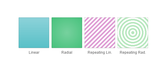
Gradients give web designers the power to create smooth transitions between colors without having to resort to images. CSS gradients also look great on retina displays, because they are generated on the fly. They can be linear or radial, and can be set to repeat. They have been around for some time, but after a few minor syntax changes over the last months, they are finally available nearly everywhere, prefix-free!
HTML:-
1 2 3 4 5 6 | <div class="container"> <div id="el1">Linear</div> <div id="el2">Radial</div> <div id="el3">Repeating Lin.</div> <div id="el4">Repeating Rad.</div> </div> |
CSS:-
1 2 3 4 5 6 7 8 9 10 11 12 13 14 15 16 17 18 19 20 21 22 23 24 25 26 27 28 29 30 31 32 33 34 35 36 37 | .container{ text-align:center; padding:20px 0; width:450px; margin: 0 auto; } .container div{ width:100px; height:100px; display:inline-block; margin:2px; box-shadow: 0 0 1px rgba(0, 0, 0, 0.5) inset, 0 1px 1px #DDD; border-radius:2px; color:#666; vertical-align: top; line-height: 230px; font-size: 12px; } #el1{ background:linear-gradient(to bottom, #8dd2d9 , #58c0c7); } #el2{ background:radial-gradient(#77d19e,#46c17b); } #el3{ background:repeating-linear-gradient(-45deg, #de9dd4, #de9dd4 5px, white 5px, white 10px); } #el4{ background:repeating-radial-gradient(#b8e7bf, #b8e7bf 5px, white 5px, white 10px); } |
6. Webfonts
Can you imagine that there was a time when we were limited to only a handful of “web-safe” fonts and nothing else? It is hard to believe, given that today we have services like Google Fonts and typekit, which let you embed beautiful fonts by simply including a stylesheet in your page. There are even icon fonts like fontawesome, which contain pretty vector icons, instead of letters or numbers. This was all made possible by the code>@font-facerule, which lets you define the name, characteristics and source files for fonts, which you can later refer in your font/font-family declarations.
1 2 3 | <link href="https://fonts.googleapis.com/css?family=Satisfy" rel="stylesheet" /> <h1>This is my pretty webfont!</h1> |
1 2 3 4 5 6 7 | h1{ /* Using the custom font we've included in the HTML tab: */ font-family: Satisfy, cursive; font-weight:normal; font-size:24px; padding-top: 60px; } |
Note that due to security limitations in browsers, I was not able to embed a local font in the inline editor above, so I used one from Google Webfonts instead. But you can see a working example here.
With some workarounds, webfonts work on browsers as old as IE6. The two hosted services I mentioned above handle these cases for you, so you don’t have to.
7. Box Sizing
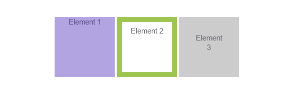
The single biggest cause for headaches for CSS beginners is the box model. The standardization bodies have probably had their reasons, but it doesn’t feel at all intuitive to have the CSS width and height of an element affected by its padding and borders. This little (mis)feature breaks layouts and wreaks havoc, but finally there is a way to restore our sanity by using the box-sizing rule. You can set it to border-box, which makes elements behave exactly the way you expect. See for yourself:
HTML:-
1 2 3 4 5 | <div class="container"> <div id="el1">Element 1</div> <div id="el2">Element 2</div> <div id="el3">Element 3</div> </div> |
CSS:-
1 2 3 4 5 6 7 8 9 10 11 12 13 14 15 16 17 18 19 20 21 22 23 24 25 26 27 28 29 30 31 32 33 34 35 36 | .container{ text-align:center; } .container div{ /* Setting the box-sizing method: */ box-sizing:border-box; /* Firefox still requires the -moz prefix */ -moz-box-sizing:border-box; width:120px; height:120px; display:inline-block; vertical-align:top; } /* Thanks to box-sizing, we can set whatever padding and border we want, and the elements will still keep the same size */ #el1{ color:#524480; background-color:#B2A4E0; } #el2{ padding:8px; border:10px solid #9ec551; background-color:#fff; } #el3{ padding:32px; background-color:#ccc; } |
8. Border Images
The border-image property allows you to display custom designed borders around elements. The borders are contained in a single image (sprite), with each region of that image corresponding to a different part of the border. Here is the image used in the below example.
1 | <p>Say hello to a fancy border image!</p> |
1 2 3 4 5 6 7 8 9 10 | p{ text-align:center; padding:20px; width:340px; margin: 0 auto; /* Set the border and border image properties */ border:30px solid transparent; border-image:url(https://demo.tutorialzine.com/2013/10/css3-features-you-can-finally-use/assets/img/border.png) 30 30 round; } |
For a more in-depth look, check out this MDN page and this article on CSS tricks. Border images are supported in all major browsers and IE11.
9. Media Queries
Media queries are an absolute must if you are serious about web design. They have been around for a while, but are worth a mention, because they have transformed the way we build websites. It used to be that you had a regular website, wide enough to fit the smallest monitor resolution used at the time, and a separate mobile website. These days, we build sites that are responsive and which adapt to the type of device, orientation and resolution.
Media queries are surprisingly easy to use – all you need to do is to enclose CSS styles in a block guarded by a code>@media rule. Each code>@media block is activated when one or more conditions are met. As an example, try resizing this page. I have also included it in the editor below; try removing the the code>@media block to see what happens.
1 2 3 4 5 6 7 8 9 10 11 12 13 14 15 16 17 18 19 20 21 22 23 24 25 26 27 28 29 30 31 32 33 34 35 36 37 38 39 40 41 42 43 44 45 46 47 48 49 50 | /* Style the main content and the sidebar */ .container{ width:900px; margin: 0 auto; overflow:hidden; } .main-section{ background-color:#CDEBC4; color:#6D8B64; width:520px; float:left; height:500px; } .sidebar{ background-color:#ccc; width:350px; float:right; height:400px; } .container p{ padding-top:100px; text-align:center; } .note{ text-align:center; padding-top:60px; font-style:italic; } /* This simple media query makes the column layout linear on smaller screens */ @media (max-width:900px){ .container{ width:100%; } .main-section, .sidebar{ width:auto; margin-bottom:20px; float:none; } } |
The media query can contain checks for the device resolution and orientation, color depth, pixel density and more. Read an in-depth article here, and see the compatibility table.
10. Multiple Backgrounds
With multiple backgrounds, designers can achieve very interesting effects. They can stack different images as backgrounds of the same element. Each image (or layer) can be moved and animated independently, like you can see in the demo below (try hovering over the image with your mouse). All background-releated CSS rules can now take a comma-delimited list of properties, each for the specific background image:
1 2 3 4 5 6 7 8 9 10 11 12 13 14 15 16 17 18 19 | .space{ /* Pass a comma separated list of backgrounds: */ background:url('https://demo.tutorialzine.com/2013/10/css3-features-you-can-finally-use/assets/img/rocket_big.png') no-repeat center 70px, url('https://demo.tutorialzine.com/2013/10/css3-features-you-can-finally-use/assets/img/space.jpg') no-repeat bottom center; width:200px; height:200px; margin: 0 auto; border-radius:3px; /* Animate the positions of both of the backgrounds */ transition:background-position 1s; } .space:hover{ /* The same goes for properties like background-position and repeat */ background-position:35% 20px, top right; } |
For more information on multiple backgrounds, see here. Browser support is very good – all recent versions support the rule (see the table).
11. CSS Columns
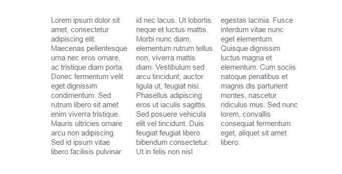
Column-based layouts were notoriously difficult to pull off in CSS. It usually involved using JavaScript or server-side processing that splits the content into different elements. This is unnecessarily complicated and takes precious development time away from what really matters. Fortunately, now there is a way around this by using the CSS columns rule:
1 2 3 | <div class="container"> <p>Lorem ipsum dolor sit amet, consectetur adipiscing elit. Maecenas pellentesque urna nec eros ornare, ac tristique diam porta. Donec fermentum velit eget dignissim condimentum. Sed rutrum libero sit amet enim viverra tristique. Mauris ultricies ornare arcu non adipiscing. Sed id ipsum vitae libero facilisis pulvinar id nec lacus. Ut lobortis neque et luctus mattis. Morbi nunc diam, elementum rutrum tellus non, viverra mattis diam. Vestibulum sed arcu tincidunt, auctor ligula ut, feugiat nisi. Phasellus adipiscing eros ut iaculis sagittis. Sed posuere vehicula elit vel tincidunt. Duis feugiat feugiat libero bibendum consectetur. Ut in felis non nisl egestas lacinia. Fusce interdum vitae nunc eget elementum. Quisque dignissim luctus magna et elementum. Cum sociis natoque penatibus et magnis dis parturient montes, nascetur ridiculus mus. Sed nunc lorem, convallis consequat fermentum eget, aliquet sit amet libero.</p> </div> |
1 2 3 4 5 6 7 8 9 10 11 12 | .container{ width: 500px; margin: 0 auto; } /* Creating columns is as simple as this: */ .container p{ -moz-columns:3; -webkit-columns:3; columns:3; } |
There is good support for this rule, although it still requires prefixes. Where things break down is with the support of some of the other column-related rules and differences between browsers in handling corner cases.
12. CSS 3D Transforms
There is nothing more flashy and full with eye-candy than an impressive 3D CSS demo. Although its utility outside of demos or portfolio sites is questionable, 3D CSS offers some powerful features to designers and developers that can win the hearts of users if done with good measure.
1 2 3 4 5 6 7 8 9 10 11 12 13 14 15 16 17 18 19 20 21 22 23 24 25 26 27 28 29 30 31 32 33 34 35 36 37 38 39 40 41 42 43 44 45 46 47 48 49 50 51 52 53 54 55 56 57 58 59 60 61 62 | .container{ /* How pronounced should the 3D effects be */ perspective: 800px; -webkit-perspective: 800px; background: radial-gradient(#e0e0e0, #aaa); width:480px; height:480px; margin:0 auto; border-radius:6px; position:relative; } .iphone-front, .iphone-back{ /* Enable 3D transforms */ transform-style: preserve-3d; -webkit-transform-style: preserve-3d; /* We are using two separate divs for the front and back of the phone. This will hide the divs when they are flipped, so that the opposite side can be seen: */ backface-visibility: hidden; -webkit-backface-visibility: hidden; width:200px; height:333px; position:absolute; top:50%; left:50%; margin:-166px 0 0 -100px; background:url(https://demo.tutorialzine.com/2013/10/css3-features-you-can-finally-use/assets/img/iphone.png) no-repeat left center; /* Animate the transitions */ transition:0.8s; } .iphone-back{ /* The back side is flipped 180 deg by default */ transform:rotateY(180deg); -webkit-transform:rotateY(180deg); background-position:right center; } .container:hover .iphone-front{ /* When the container is hovered, flip the front side and hide it .. */ transform:rotateY(180deg); -webkit-transform:rotateY(180deg); } .container:hover .iphone-back{ /* .. at the same time flip the back side into visibility */ transform:rotateY(360deg); -webkit-transform:rotateY(360deg); } |
1 2 3 4 | <div class="container"> <div class="iphone-front"></div> <div class="iphone-back"></div> </div> |

 by
by 
