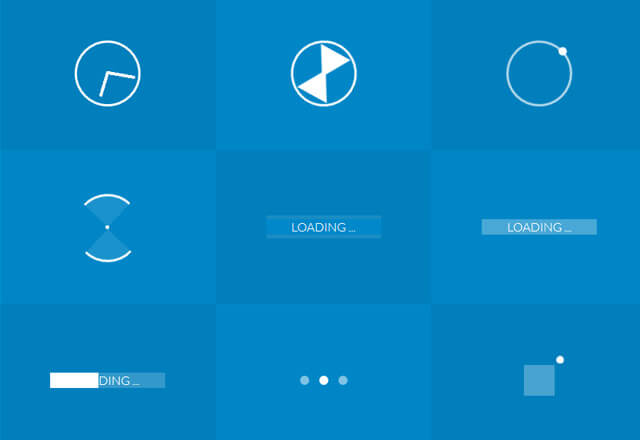

Hello, Today I am going to share with you a rang of pure css3 preloaders html and css codes. By using these preloaders you can replace animated gif to make it more light in weight and more effective by visualization. Sure you will like to add these preloaders with you website, if you are getting any problem in ingration with your website I can help you there.
Pleaes feel free and contact to me anytime.
I have craeated these css preloaders with advance css properties like transition, transform and keyframes. These properties can make this more effective and animative.
These preloader become more usefull when your website is bulky and taking much time to load on browser you can simply use these preloaders to entertain you users with its visual effects which is its animation and smooth transition using keyframe enhancement rather than whole website optimization which can take more time and efforts.
In this tutorial we will add a CSS3 transitions to our already created CSS3 preloader.
What you will learn
- how to use CSS3 transitions
- how to animate out a preloader
- how to combine CSS3 with keyframes
You can check it with codes as given below. There are too many example as given in code
First of all add basic html structure
Html Code
<div class="container">
  <div class="box">
    <div class="clock"></div>
    <p>Clock</p>
  </div>
  <div class="box">
    <div class="hourglass"></div>
    <p>Hourglass</p>
  </div>
  <div class="box">
    <div class="loader1"></div>
    <p>Loader 1</p>
  </div>
  <div class="box">
    <div class="loader2"></div>
    <p>loader 2</p>
  </div>
  <div class="box">
    <div class="loader3"></div>
    <p>loader 3</p>
  </div>
  <div class="box">
    <div class="loader4"></div>
    <p>loader 4</p>
  </div>
  <div class="box">
    <div class="loader5"></div>
    <p>loader 5</p>
  </div>
  <div class="box">
    <div class="loader6"></div>
    <p>loader 6</p>
  </div>
  <div class="box">
    <div class="loader7"></div>
    <p>loader 7</p>
  </div>
  <div class="box">
    <div class="loader8"></div>
    <p>loader 8</p>
  </div>
  <div class="box">
    <div class="loader9"></div>
    <p>loader 9</p>
  </div>
  <div class="box">
    <div class="loader10"></div>
    <p>loader 10 </p>
  </div>
</div>
Add unique styling to each loaders by putting css in stylsheet
CSS Code
.container{
	text-align: center;
	background-color: #0086C6;
	overflow: hidden;
}

.box:nth-child(2n-1){
	background-color: rgba(0,0,0,0.05);
}

.box{
	display: inline-block;
	height: 200px;
	width: 33.3%;
	float:left;
	position: relative;
	/*margin:0 -4px -5px -2px;*/
	transition: all .2s ease;
}


.box p{
	color: #777;
	font-family:  Lato,"Helvetica Neue" ;
	font-weight: 300;
	position: absolute;
	font-size: 15px;
	letter-spacing:2px;
	width: 100%;
	height: 20px;
	text-align: center;
	bottom: 0px;
	margin: 0;
	top:155px;
	background-color: #fff;
	opacity: 0;
	padding:7px 0;
	text-transform: uppercase;
	transition: all .5s ease;
}

.box:hover p{
	bottom:0px;
	top:166px;
	opacity: 0.8;
	transition: all .5s ease;
	z-index: 2;
}


/* MEDIA QUERIES */
@media (max-width: 700px){
	.box{
		width: 50%;
	}

	.box:nth-child(2n-1){
		background-color: inherit;
	}

	.box:nth-child(4n),.box:nth-child(4n-3) {
		background-color: rgba(0,0,0,0.05);
	}

}

@media (max-width: 420px){
	.box{
		width: 100%;
	}

	.box:nth-child(4n),.box:nth-child(4n-3){
		background-color: inherit;
	}

	.box:nth-child(2n-1){
		background-color:rgba(0,0,0,0.05);
	}

}


/* -------------- Clock -------------- */

.clock{
	border-radius: 60px;
	border: 3px solid #fff;
	height: 80px;
	width: 80px;
	position: relative;

	top: 28%;
	top: -webkit-calc(50% - 43px);
	top: calc(50% - 43px);
	left: 35%;
	left: -webkit-calc(50% - 43px);
	left: calc(50% - 43px);
}
.clock:after{
	content: "";
	position: absolute;
	background-color: #fff;
	top:2px;
	left: 48%;
	height: 38px;
	width: 4px;
	border-radius: 5px;
	-webkit-transform-origin: 50% 97%;
			transform-origin: 50% 97%;
	-webkit-animation: grdAiguille 2s linear infinite;
			animation: grdAiguille 2s linear infinite;
}

@-webkit-keyframes grdAiguille{
    0%{-webkit-transform:rotate(0deg);}
    100%{-webkit-transform:rotate(360deg);}
}

@keyframes grdAiguille{
    0%{transform:rotate(0deg);}
    100%{transform:rotate(360deg);}
}

.clock:before{
	content: "";
	position: absolute;
	background-color: #fff;
	top:6px;
	left: 48%;
	height: 35px;
	width: 4px;
	border-radius: 5px;
	-webkit-transform-origin: 50% 94%;
			transform-origin: 50% 94%;
	-webkit-animation: ptAiguille 12s linear infinite;
			animation: ptAiguille 12s linear infinite;
}

@-webkit-keyframes ptAiguille{
    0%{-webkit-transform:rotate(0deg);}
    100%{-webkit-transform:rotate(360deg);}
}

@keyframes ptAiguille{
    0%{transform:rotate(0deg);}
    100%{transform:rotate(360deg);}
}


/* -------------- Sablier -------------- */

.hourglass{
	position: relative;
	height: 80px;
	width: 80px;
	top: 28%;
	top: -webkit-calc(50% - 43px);
	top: calc(50% - 43px);
	left: 35%;
	left: -webkit-calc(50% - 43px);
	left: calc(50% - 43px);
	border: 3px solid #fff;
	border-radius: 80px;
	-webkit-transform-origin: 50% 50%;
			transform-origin: 50% 50%;
	-webkit-animation: hourglass 2s ease-in-out infinite;
			animation: hourglass 2s ease-in-out infinite;
}

.hourglass:before{
	content: "";
	position: absolute;
	top:8px;
	left: 18px;
	width: 0px;
	height: 0px;
	border-style: solid;
	border-width: 37px 22px 0 22px;
	border-color: #fff transparent transparent transparent;
}
.hourglass:after{
	content: "";
	position: absolute;
	top: 35px;
	left: 18px;
	width: 0px;
	height: 0px;
	border-style: solid;
	border-width: 0 22px 37px 22px;
	border-color: transparent transparent #fff transparent;
}

@-webkit-keyframes hourglass{
    0%{-webkit-transform:rotate(0deg);}
    100%{-webkit-transform:rotate(180deg);}
}

@keyframes hourglass{
    0%{transform:rotate(0deg);}
    100%{transform:rotate(180deg);}
}

/* -------------- Loader1 -------------- */

.loader1{
	position: relative;
	height: 80px;
	width: 80px;
	border-radius: 80px;
	border: 3px solid  rgba(255,255,255, .7);

	top: 28%;
	top: -webkit-calc(50% - 43px);
	top: calc(50% - 43px);
	left: 35%;
	left: -webkit-calc(50% - 43px);
	left: calc(50% - 43px);

	-webkit-transform-origin: 50% 50%;
			transform-origin: 50% 50%;
	-webkit-animation: loader1 3s linear infinite;
			animation: loader1 3s linear infinite;
}

.loader1:after{
	content: "";
	position: absolute;
	top: -5px;
	left: 20px;
	width: 11px;
	height: 11px;
	border-radius: 10px;
	background-color: #fff;
}

@-webkit-keyframes loader1{
    0%{-webkit-transform:rotate(0deg);}
    100%{-webkit-transform:rotate(360deg);}
}

@keyframes loader1{
    0%{transform:rotate(0deg);}
    100%{transform:rotate(360deg);}
}


/* -------------- loader2 -------------- */

.loader2{
	position: relative;
	width: 5px;
	height: 5px;

	top: 49%;
	top: -webkit-calc(50% - 43px);
	top: calc(50% - 2.5px);
	left: 49%;
	left: -webkit-calc(50% - 43px);
	left: calc(50% - 2.5px);

	background-color: #fff;
	border-radius: 50px;
}

.loader2:before{
	content: "";
	position: absolute;
	top: -38px;
	border-top: 3px solid #fff;
	border-right: 3px solid #fff;
	border-radius: 0 50px 0px  0;
	width: 40px;
	height: 40px;
	background-color: rgba(255, 255, 255, .1);
	-webkit-transform-origin:  0% 100%;
			transform-origin:  0% 100% ;
	-webkit-animation: loader2 1.5s linear infinite;
			animation: loader2 1.5s linear infinite;
}

.loader2:after{
	content: "";
	position: absolute;
	top: 2px;
	right: 2px;
	border-bottom: 3px solid #fff;
	border-left: 3px solid #fff;
	border-radius: 0 0px 0px  50px;
	width: 40px;
	height: 40px;
	background-color: rgba(255, 255, 255, .1);
	-webkit-transform-origin:  100% 0%;
			transform-origin:  100% 0% ;
	-webkit-animation: loader2 1.5s linear infinite;
			animation: loader2 1.5s linear infinite;
}


@-webkit-keyframes loader2{
    0%{-webkit-transform:rotate(0deg);}
    100%{-webkit-transform:rotate(360deg);}
}

@keyframes loader2{
    0%{transform:rotate(0deg);}
    100%{transform:rotate(360deg);}
}


/* -------------- loader3 -------------- */

.loader3{
	position: relative;
	width: 150px;
	height: 20px;

	top: 45%;
	top: -webkit-calc(50% - 10px);
	top: calc(50% - 10px);
	left: 25%;
	left: -webkit-calc(50% - 75px);
	left: calc(50% - 75px);
}

.loader3:after{
	content: "LOADING ...";
	color: #fff;
	font-family:  Lato,"Helvetica Neue" ;
	font-weight: 200;
	font-size: 16px;
	position: absolute;
	width: 100%;
	height: 20px;
	line-height: 20px;
	left: 0;
	top: 0;
	background-color: #0088CA;
	z-index: 1;
}

.loader3:before{
	content: "";
	position: absolute;
	background-color: #fff;
	top: -5px;
	left: 0px;
	height: 30px;
	width: 0px;
	z-index: 0;
	opacity: 1;
	-webkit-transform-origin:  100% 0%;
			transform-origin:  100% 0% ;
	-webkit-animation: loader3 10s ease-in-out infinite;
			animation: loader3 10s ease-in-out infinite;
}


@-webkit-keyframes loader3{
    0%{width: 0px;}
    70%{width: 100%; opacity: 1;}
    90%{opacity: 0; width: 100%;}
    100%{opacity: 0;width: 0px;}
}

@keyframes loader3{
    0%{width: 0px;}
    70%{width: 100%; opacity: 1;}
    90%{opacity: 0; width: 100%;}
    100%{opacity: 0;width: 0px;}
}

/* -------------- loader4 -------------- */

.loader4{
	position: relative;
	width: 150px;
	height: 20px;

	top: 45%;
	top: -webkit-calc(50% - 10px);
	top: calc(50% - 10px);
	left: 25%;
	left: -webkit-calc(50% - 75px);
	left: calc(50% - 75px);

	background-color: rgba(255,255,255,0.2);
}

.loader4:before{
	content: "";
	position: absolute;
	background-color: #fff;
	top: 0px;
	left: 0px;
	height: 20px;
	width: 0px;
	z-index: 0;
	opacity: 1;
	-webkit-transform-origin:  100% 0%;
			transform-origin:  100% 0% ;
	-webkit-animation: loader4 10s ease-in-out infinite;
			animation: loader4 10s ease-in-out infinite;
}

.loader4:after{
	content: "LOADING ...";
	color: #fff;
	font-family:  Lato,"Helvetica Neue" ;
	font-weight: 200;
	font-size: 16px;
	position: absolute;
	width: 100%;
	height: 20px;
	line-height: 20px;
	left: 0;
	top: 0;
}

@-webkit-keyframes loader4{
    0%{width: 0px;}
    70%{width: 100%; opacity: 1;}
    90%{opacity: 0; width: 100%;}
    100%{opacity: 0;width: 0px;}
}

@keyframes loader4{
    0%{width: 0px;}
    70%{width: 100%; opacity: 1;}
    90%{opacity: 0; width: 100%;}
    100%{opacity: 0;width: 0px;}
}

/* -------------- loader5 -------------- */
.loader5{
	position: relative;
	width: 150px;
	height: 20px;

	top: 45%;
	top: -webkit-calc(50% - 10px);
	top: calc(50% - 10px);
	left: 25%;
	left: -webkit-calc(50% - 75px);
	left: calc(50% - 75px);

	background-color: rgba(255,255,255,0.2);
}

.loader5:after{
	content: "LOADING ...";
	color: #fff;
	font-family:  Lato,"Helvetica Neue" ;
	font-weight: 200;
	font-size: 16px;
	position: absolute;
	width: 100%;
	height: 20px;
	line-height: 20px;
	left: 0;
	top: 0;
}

.loader5:before{
	content: "";
	position: absolute;
	background-color: #fff;
	top: 0px;
	height: 20px;
	width: 0px;
	z-index: 0;
	-webkit-transform-origin:  100% 0%;
			transform-origin:  100% 0% ;
	-webkit-animation: loader5 7s ease-in-out infinite;
			animation: loader5 7s ease-in-out infinite;
}

@-webkit-keyframes loader5{
    0%{width: 0px; left: 0px}
    48%{width: 100%; left: 0px}
    50%{width: 100%; right: 0px}
    52%{width: 100%; right: 0px}
    100%{width: 0px; right: 0px}
}

@keyframes loader5{
    0%{width: 0px; left: 0px}
    48%{width: 100%; left: 0px}
    50%{width: 100%; right: 0px}
    52%{width: 100%; right: 0px}
    100%{width: 0px; right: 0px}
}

/* -------------- loader6 -------------- */

.loader6{
	position: relative;
	width: 12px;
	height: 12px;

	top: 46%;
	top: -webkit-calc(50% - 6px);
	top: calc(50% - 6px);
	left: 46%;
	left: -webkit-calc(50% - 6px);
	left: calc(50% - 6px);

	border-radius: 12px;
	background-color: #fff;
	-webkit-transform-origin:  50% 50%;
			transform-origin:  50% 50% ;
	-webkit-animation: loader6 1s ease-in-out infinite;
			animation: loader6 1s ease-in-out infinite;
}

.loader6:before{
	content: "";
	position: absolute;
	background-color: rgba(255, 255, 255, .5);
	top: 0px;
	left: -25px;
	height: 12px;
	width: 12px;
	border-radius: 12px;
}

.loader6:after{
	content: "";
	position: absolute;
	background-color: rgba(255, 255 ,255 ,.5);
	top: 0px;
	left: 25px;
	height: 12px;
	width: 12px;
	border-radius: 12px;
}


@-webkit-keyframes loader6{
    0%{-webkit-transform:rotate(0deg);}
    50%{-webkit-transform:rotate(180deg);}
    100%{-webkit-transform:rotate(180deg);}
}

@keyframes loader6{
    0%{transform:rotate(0deg);}
    50%{transform:rotate(180deg);}
    100%{transform:rotate(180deg);}
}

/* -------------- loader7 -------------- */

.loader7{
	position: relative;
	width: 40px;
	height: 40px;

	top: 40%;
	top: -webkit-calc(50% - 20px);
	top: calc(50% - 20px);
	left: 43%;
	left: -webkit-calc(50% - 20px);
	left: calc(50% - 20px);

	background-color: rgba(255, 255, 255, .2);
}

.loader7:before{
	content: "";
	position: absolute;
	background-color: #fff;
	height: 10px;
	width: 10px;
	border-radius: 10px;
	-webkit-animation: loader7 2s ease-in-out infinite;
			animation: loader7 2s ease-in-out infinite;
}

.loader7:after{
	content: "";
	position: absolute;
	background-color: #fff;
	top: 0px;
	left: 0px;
	height: 40px;
	width: 0px;
	z-index: 0;
	opacity: 1;
	-webkit-animation: loader72 10s ease-in-out infinite;
			animation: loader72 10s ease-in-out infinite;
}


@-webkit-keyframes loader7{
    0%{left: -12px; top: -12px;}
    25%{left:42px; top:-12px;}
    50%{left: 42px; top: 42px;}
    75%{left: -12px; top: 42px;}
    100%{left:-12px; top:-12px;}
}

@keyframes loader7{
    0%{left: -12px; top: -12px;}
    25%{left:42px; top:-12px;}
    50%{left: 42px; top: 42px;}
    75%{left: -12px; top: 42px;}
    100%{left:-12px; top:-12px;}
}

@-webkit-keyframes loader72{
    0%{width: 0px;}
    70%{width: 40px; opacity: 1;}
    90%{opacity: 0; width: 40px;}
    100%{opacity: 0;width: 0px;}
}

@keyframes loader72{
    0%{width: 0px;}
    70%{width: 40px; opacity: 1;}
    90%{opacity: 0; width: 40px;}
    100%{opacity: 0;width: 0px;}
}

/* -------------- loader8 -------------- */

.loader8{
	position: relative;
	width: 80px;
	height: 80px;

	top: 28%;
	top: -webkit-calc(50% - 43px);
	top: calc(50% - 43px);
	left: 35%;
	left: -webkit-calc(50% - 43px);
	left: calc(50% - 43px);

	border-radius: 50px;
	background-color: rgba(255, 255, 255, .2);
	border-width: 40px;
	border-style: double;
	border-color:transparent  #fff;

	-webkit-box-sizing:border-box;
	-moz-box-sizing:border-box;
		box-sizing:border-box;

	-webkit-transform-origin:  50% 50%;
		transform-origin:  50% 50% ;
	-webkit-animation: loader8 2s linear infinite;
		animation: loader8 2s linear infinite;

}


@-webkit-keyframes loader8{
    0%{-webkit-transform:rotate(0deg);}
    100%{-webkit-transform:rotate(360deg);}
}

@keyframes loader8{
    0%{transform:rotate(0deg);}
    100%{transform:rotate(360deg);}
}


/* -------------- loader9 -------------- */

.loader9:before{
	content: "";
	position: absolute;
	top: 0px;
	height: 12px;
	width: 12px;
	border-radius: 12px;
	-webkit-animation: loader9g 3s ease-in-out infinite;
			animation: loader9g 3s ease-in-out infinite;
}

.loader9{
	position: relative;
	width: 12px;
	height: 12px;
	top: 46%;
	left: 46%;
	border-radius: 12px;
	background-color: #fff;
}


.loader9:after{
	content: "";
	position: absolute;
	top: 0px;
	height: 12px;
	width: 12px;
	border-radius: 12px;
	-webkit-animation: loader9d 3s ease-in-out infinite;
			animation: loader9d 3s ease-in-out infinite;
}

@-webkit-keyframes loader9g{
	0%{	left: -25px; background-color: rgba(255, 255, 255, .8); }
	50%{ left: 0px; background-color: rgba(255, 255, 255, .1);}
	100%{ left:-25px; background-color: rgba(255, 255, 255, .8); }
}
@keyframes loader9g{
	0%{	left: -25px; background-color: rgba(255, 255, 255, .8); }
	50%{ left: 0px; background-color: rgba(255, 255, 255, .1);}
	100%{ left:-25px; background-color: rgba(255, 255, 255, .8); }
}


@-webkit-keyframes loader9d{
	0%{	left: 25px; background-color: rgba(255, 255, 255, .8); }
	50%{ left: 0px; background-color: rgba(255, 255, 255, .1);}
	100%{ left:25px; background-color: rgba(255, 255, 255, .8); }
}
@keyframes loader9d{
	0%{	left: 25px; background-color: rgba(255, 255, 255, .8); }
	50%{ left: 0px; background-color: rgba(255, 255, 255, .1);}
	100%{ left:25px; background-color: rgba(255, 255, 255, .8); }
}

/* -------------- loader10 -------------- */

.loader10:before{
	content: "";
	position: absolute;
	top: 0px;
	left: -25px;
	height: 12px;
	width: 12px;
	border-radius: 12px;
	-webkit-animation: loader10g 3s ease-in-out infinite;
			animation: loader10g 3s ease-in-out infinite;
}

.loader10{
	position: relative;
	width: 12px;
	height: 12px;
	top: 46%;
	left: 46%;
	border-radius: 12px;
	-webkit-animation: loader10m 3s ease-in-out infinite;
			animation: loader10m 3s ease-in-out infinite;
}


.loader10:after{
	content: "";
	position: absolute;
	top: 0px;
	left: 25px;
	height: 10px;
	width: 10px;
	border-radius: 10px;
	-webkit-animation: loader10d 3s ease-in-out infinite;
			animation: loader10d 3s ease-in-out infinite;
}

@-webkit-keyframes loader10g{
	0%{background-color: rgba(255, 255, 255, .2);}
	25%{background-color: rgba(255, 255, 255, 1);}
	50%{background-color: rgba(255, 255, 255, .2);}
	75%{background-color: rgba(255, 255, 255, .2);}
	100%{background-color: rgba(255, 255, 255, .2);}
}
@keyframes loader10g{
	0%{background-color: rgba(255, 255, 255, .2);}
	25%{background-color: rgba(255, 255, 255, 1);}
	50%{background-color: rgba(255, 255, 255, .2);}
	75%{background-color: rgba(255, 255, 255, .2);}
	100%{background-color: rgba(255, 255, 255, .2);}
}

@-webkit-keyframes loader10m{
	0%{background-color: rgba(255, 255, 255, .2);}
	25%{background-color: rgba(255, 255, 255, .2);}
	50%{background-color: rgba(255, 255, 255, 1);}
	75%{background-color: rgba(255, 255, 255, .2);}
	100%{background-color: rgba(255, 255, 255, .2);}
}
@keyframes loader10m{
	0%{background-color: rgba(255, 255, 255, .2);}
	25%{background-color: rgba(255, 255, 255, .2);}
	50%{background-color: rgba(255, 255, 255, 1);}
	75%{background-color: rgba(255, 255, 255, .2);}
	100%{background-color: rgba(255, 255, 255, .2);}
}

@-webkit-keyframes loader10d{
	0%{background-color: rgba(255, 255, 255, .2);}
	25%{background-color: rgba(255, 255, 255, .2);}
	50%{background-color: rgba(255, 255, 255, .2);}
	75%{background-color: rgba(255, 255, 255, 1);}
	100%{background-color: rgba(255, 255, 255, .2);}
}
@keyframes loader10d{
	0%{background-color: rgba(255, 255, 255, .2);}
	25%{background-color: rgba(255, 255, 255, .2);}
	50%{background-color: rgba(255, 255, 255, .2);}
	75%{background-color: rgba(255, 255, 255, 1);}
	100%{background-color: rgba(255, 255, 255, .2);}
}