


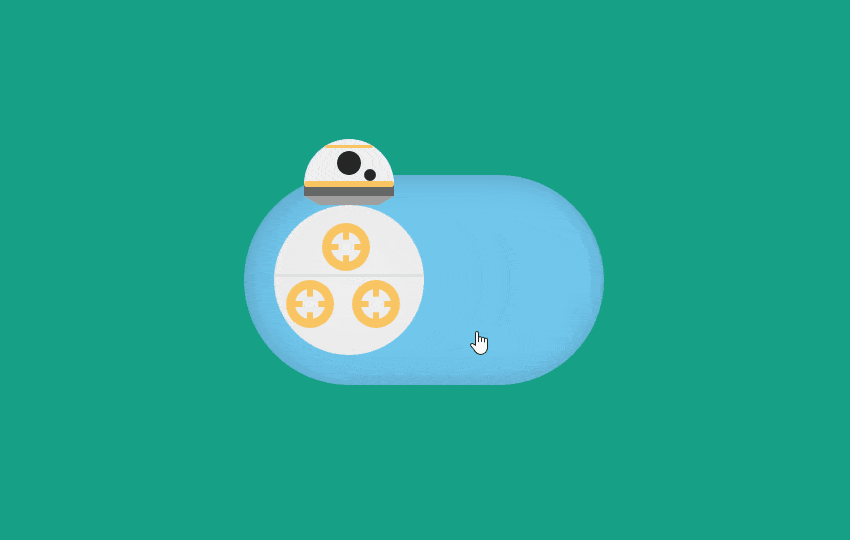
BB8 Toggle Switch Animation using CSS is inspired from movie web design where I have taken Star wars movie character BB8 as my Toggle Switch Button, when you click on button BB8 Will animate from Left to right inside toggle switch in both backward animation and forward animation.
Here in this article, we will look at a CSS Toggle Switch example using BB8 Droid from movie Star wars. We will create it using only CSS code to archives toggle switch by adding hidden checkbox functionality.
Similarly I have shared two fantastic animations effect which also a pure css effect hope you like to see them too:
This toggle Animation is created with only using CSS with the help of HTML structure. As you know HTML structure is just like Skelton without cloth and makeup, CSS makes it complete by beautifying it.
I do love Watching movies, especially Hollywood Movies and one of my favorite movie series in star wars so that here I have selected BB8 from star wars character.
You may have seen many kind of toggle Animation or toggle switch button but it is unique in its kind as I am representing.
Here I have selected a hidden checkbox along with label, on its selection both background and BB8 will animate.
In this example what we need just check/uncheck the hidden checkbox by clicking on the label setup by fetching these value we can apply different CSS attributes on elements to show toggle switch or background color change.
Let’s understand it in brief by coding:
HTML Structure:
<input type="checkbox" id="bb8_cb"/>
    <label for="bb8_cb">
        <div id="bb8">
            <div id="bb8_head">
                <div id="half_circle">
                    <div id="or0"></div>
                    <div id="lens1"></div>
                    <div id="lens2"></div>
                    <div id="or1"></div>
                </div>
                <div id="dg1"></div>
                <div id="lg1"></div>
            </div>
            <div id="bb8_body">
                <div id="lg2"></div>
                <div id="c1">
                    <div class="s1"></div>
                    <div class="s2"></div>
                </div>
                <div id="c2">
                    <div class="s1"></div>
                    <div class="s2"></div>
                </div>
                <div id="c3">
                    <div class="s1"></div>
                    <div class="s2"></div>
                </div>
            </div>
        </div>
    </label>
<section></section>
CSS Style sheet:
html,
body{
    height: 100%;
	width:100%;
	transform:scale(1.4,1.4);
}

section{
	position: absolute;
	top:0;
	left:0;
	height: 100%;
	width:100%;
    background: #16A085;
	z-index: -10;
}

* {
    transition: 1s all;
}

body {
    margin: 0;
    font-family: Helvetica, Arial;
    font-weight: 100;
    overflow: hidden;
    display: flex;
    justify-content: center;
    align-items: center;
}

input[type=checkbox] {
    display: none;
}

input[type=checkbox] + label {
    width: 100px;
    height: 50px;
    display: block;
    border-radius: 35px;
    background-color: #70c6ec;
    padding: 10px;
    box-shadow: inset 0 0 10px rgba(0,0,0,0.2);
	cursor: pointer;
	cursor: hand;
}

#bb8_body {
    width: 50px;
    height: 50px;
    border-radius: 100%;
    background: rgba(240, 240, 240, 1);
    background: -moz-radial-gradient(center, ellipse cover, rgba(240, 240, 240, 1) 0%, rgba(235, 235, 235, 1) 72%, rgba(191, 191, 191, 1) 100%);
    background: -webkit-gradient(radial, center center, 0px, center center, 100%, color-stop(0%, rgba(240, 240, 240, 1)), color-stop(72%, rgba(235, 235, 235, 1)), color-stop(100%, rgba(191, 191, 191, 1)));
    background: -webkit-radial-gradient(center, ellipse cover, rgba(240, 240, 240, 1) 0%, rgba(235, 235, 235, 1) 72%, rgba(191, 191, 191, 1) 100%);
    background: -o-radial-gradient(center, ellipse cover, rgba(240, 240, 240, 1) 0%, rgba(235, 235, 235, 1) 72%, rgba(191, 191, 191, 1) 100%);
    background: -ms-radial-gradient(center, ellipse cover, rgba(240, 240, 240, 1) 0%, rgba(235, 235, 235, 1) 72%, rgba(191, 191, 191, 1) 100%);
    background: radial-gradient(ellipse at center, rgba(240, 240, 240, 1) 0%, rgba(235, 235, 235, 1) 72%, rgba(191, 191, 191, 1) 100%);
    filter: progid: DXImageTransform.Microsoft.gradient( startColorstr='#f0f0f0', endColorstr='#bfbfbf', GradientType=1);
}

#c1,
#c2,
#c3 {
    width: 10px;
    height: 10px;
    border-radius: 100%;
    border: 3px solid #fac562;
    position: relative;
}

.s1 {
    background: #fac562;
    /* Old browsers */
    background: -moz-linear-gradient(top, #fac562 0%, #fac562 24%, #f0f0f0 27%, #f0f0f0 76%, #fac562 79%, #fac562 100%);
    /* FF3.6-15 */
    background: -webkit-linear-gradient(top, #fac562 0%, #fac562 24%, #f0f0f0 27%, #f0f0f0 76%, #fac562 79%, #fac562 100%);
    /* Chrome10-25,Safari5.1-6 */
    background: linear-gradient(to bottom, #fac562 0%, #fac562 24%, #f0f0f0 27%, #f0f0f0 76%, #fac562 79%, #fac562 100%);
    /* W3C, IE10+, FF16+, Chrome26+, Opera12+, Safari7+ */
    filter: progid: DXImageTransform.Microsoft.gradient( startColorstr='#fac562', endColorstr='#fac562', GradientType=0);
    /* IE6-9 */
    width: 2px;
    height: 10px;
    position: relative;
    left: 4px;
}

.s2 {
    background: #fac562;
    /* Old browsers */
    background: -moz-linear-gradient(left, #fac562 0%, #fac562 24%, #f0f0f0 27%, #f0f0f0 76%, #fac562 79%, #fac562 100%);
    /* FF3.6-15 */
    background: -webkit-linear-gradient(left, #fac562 0%, #fac562 24%, #f0f0f0 27%, #f0f0f0 76%, #fac562 79%, #fac562 100%);
    /* Chrome10-25,Safari5.1-6 */
    background: linear-gradient(to right, #fac562 0%, #fac562 24%, #f0f0f0 27%, #f0f0f0 76%, #fac562 79%, #fac562 100%);
    /* W3C, IE10+, FF16+, Chrome26+, Opera12+, Safari7+ */
    filter: progid: DXImageTransform.Microsoft.gradient( startColorstr='#fac562', endColorstr='#fac562', GradientType=1);
    /* IE6-9 */
    width: 10px;
    height: 2px;
    position: relative;
    top: -6px;
}

#c1 {
    left: 16px;
    top: 5px;
}

#c2 {
    left: 4px;
    top: 8px;
}

#c3 {
    left: 26px;
    top: -8px;
}

#half_circle {
    height: 15px;
    width: 30px;
    border-radius: 30px 30px 0 0;
    background: #f0f0f0;
}

#lens1 {
    background-color: #262626;
    width: 8px;
    height: 8px;
    border-radius: 100%;
    position: relative;
    left: 11px;
    top: 3px;
}

#lens2 {
    background-color: #262626;
    width: 4px;
    height: 4px;
    border-radius: 100%;
    position: relative;
    left: 20px;
    top: 1px;
}

#or0 {
    background-color: #fac562;
    height: 1px;
    width: 16px;
    border-radius: 1px;
    position: relative;
    top: 2px;
    left: 7px;
}

#or1 {
    background-color: #fac562;
    height: 2px;
    width: 30px;
    border-radius: 1px;
    position: relative;
    top: 1px;
}

#dg1 {
    background-color: #666666;
    height: 4px;
    width: 30px;
}

#lg1 {
    border-top: 3px solid #9f9f9f;
    border-left: 5px solid transparent;
    border-right: 5px solid transparent;
    height: 0;
    width: 20px;
}

#lg2 {
    background-color: #e0e0e0;
    height: 1px;
    width: 50px;
    position: relative;
    top: 23px;
}

#bb8_head {
    margin-left: 10px;
    margin-top: -22px;
}

input[type=checkbox]:checked + label #bb8_body {
    margin-left: calc(100% - 50px);
    transform: rotate(360deg);
}

input[type=checkbox]:checked + label #bb8_head {
    margin-left: calc(100% - 40px);
}

input[type=checkbox]:checked + label ~ section {
    background-color: #3384a8;
}
.title-text{color: rgb(242, 242, 242);
    display: block;
    font-size: 25px;
    font-weight: bold;
    position: fixed;
    text-align: center;
    text-shadow: 2px 2px 2px rgba(0, 0, 0, 0.3);
    top: 172px;
	transform:scale(1,1);
	}