


CSS3 count down clock with 1 hour length is online available for free, making them extremely cost effective without compromising their efficiency and accuracy. Each of these countdown timer clock is perfect for use in websites that are undergoing maintenance, or are under construction or are simply not available to the users for a specific time period.
This Clock have 1 Hours of duration whenever it starts and count till End of hour. Animation to property from css to set for animate count after a specific interval. Each slab in countdown divide with specific number of count to repeat process wheater it is hour, minutes or seconds.
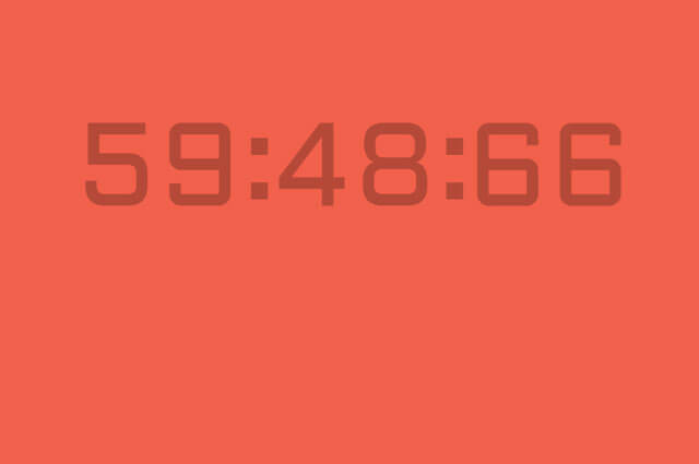
A countdown clock that is powered only
* by CSS. The countdown length is 1 hour
* and it shows minutes, seconds and the
* Hundredths of seconds as they tick.
HTML:-
 <div class='wrapper'>
  <div class='time-part-wrapper'>
    <div class='time-part minutes tens'>
      <div class='digit-wrapper'>
        <span class='digit'>0</span>
        <span class='digit'>5</span>
        <span class='digit'>4</span>
        <span class='digit'>3</span>
        <span class='digit'>2</span>
        <span class='digit'>1</span>
        <span class='digit'>0</span>
      </div>
    </div>
    <div class='time-part minutes ones'>
      <div class='digit-wrapper'>
        <span class='digit'>0</span>
        <span class='digit'>9</span>
        <span class='digit'>8</span>
        <span class='digit'>7</span>
        <span class='digit'>6</span>
        <span class='digit'>5</span>
        <span class='digit'>4</span>
        <span class='digit'>3</span>
        <span class='digit'>2</span>
        <span class='digit'>1</span>
        <span class='digit'>0</span>
      </div>
    </div>
  </div>
  <div class='time-part-wrapper'>
    <div class='time-part seconds tens'>
      <div class='digit-wrapper'>
        <span class='digit'>0</span>
        <span class='digit'>5</span>
        <span class='digit'>4</span>
        <span class='digit'>3</span>
        <span class='digit'>2</span>
        <span class='digit'>1</span>
        <span class='digit'>0</span>
      </div>
    </div>
    <div class='time-part seconds ones'>
      <div class='digit-wrapper'>
        <span class='digit'>0</span>
        <span class='digit'>9</span>
        <span class='digit'>8</span>
        <span class='digit'>7</span>
        <span class='digit'>6</span>
        <span class='digit'>5</span>
        <span class='digit'>4</span>
        <span class='digit'>3</span>
        <span class='digit'>2</span>
        <span class='digit'>1</span>
        <span class='digit'>0</span>
      </div>
    </div>
  </div>
  <div class='time-part-wrapper'>
    <div class='time-part hundredths tens'>
      <div class='digit-wrapper'>
        <span class='digit'>0</span>
        <span class='digit'>9</span>
        <span class='digit'>8</span>
        <span class='digit'>7</span>
        <span class='digit'>6</span>
        <span class='digit'>5</span>
        <span class='digit'>4</span>
        <span class='digit'>3</span>
        <span class='digit'>2</span>
        <span class='digit'>1</span>
        <span class='digit'>0</span>
      </div>
    </div>
    <div class='time-part hundredths ones'>
      <div class='digit-wrapper'>
        <span class='digit'>0</span>
        <span class='digit'>9</span>
        <span class='digit'>8</span>
        <span class='digit'>7</span>
        <span class='digit'>6</span>
        <span class='digit'>5</span>
        <span class='digit'>4</span>
        <span class='digit'>3</span>
        <span class='digit'>2</span>
        <span class='digit'>1</span>
        <span class='digit'>0</span>
      </div>
    </div>
  </div>
</div>
CSS:-
.digit {
  display: inline-block;
  font-size: 200px;
  color: rgba(0, 0, 0, 0.25);
  height: 180px;
  line-height: 1;
}

.time-part-wrapper {
  display: inline-block;
  margin-right: 50px;
  position: relative;
}
.time-part-wrapper:not(:last-child):after {
  content: ":";
  display: block;
  width: 30px;
  height: 230px;
  position: absolute;
  top: 0px;
  right: -30px;
  color: rgba(0, 0, 0, 0.25);
  font-size: 200px;
  line-height: 0.9;
}

.time-part {
  width: 140px;
  text-align: center;
  height: 180px;
  overflow: hidden;
  display: inline-block;
  margin-left: -5px;
  box-sizing: border-box;
}
.time-part .digit-wrapper {
  animation-timing-function: cubic-bezier(1, 0, 1, 0);
}
.time-part.minutes.tens .digit-wrapper {
  animation-name: minutes-tens;
  animation-duration: 3600s;
  animation-iteration-count: 1;
}
.time-part.minutes.ones .digit-wrapper {
  animation-name: minutes-ones;
  animation-duration: 600s;
  animation-iteration-count: 6;
}
.time-part.seconds.tens .digit-wrapper {
  animation-name: seconds-tens;
  animation-duration: 60s;
  animation-iteration-count: 60;
}
.time-part.seconds.ones .digit-wrapper {
  animation-name: seconds-ones;
  animation-duration: 10s;
  animation-iteration-count: 360;
}
.time-part.hundredths.tens .digit-wrapper {
  animation-name: hundredths-tens;
  animation-duration: 1s;
  animation-iteration-count: 3600;
}
.time-part.hundredths.ones .digit-wrapper {
  animation-name: hundredths-ones;
  animation-duration: 0.1s;
  animation-iteration-count: 36000;
}

@keyframes minutes-tens {
  0% {
    transform: translateY(-180px);
  }
  16.66667% {
    transform: translateY(-360px);
  }
  33.33333% {
    transform: translateY(-540px);
  }
  50% {
    transform: translateY(-720px);
  }
  66.66667% {
    transform: translateY(-900px);
  }
  83.33333% {
    transform: translateY(-1080px);
  }
}
@keyframes minutes-ones {
  0% {
    transform: translateY(-180px);
  }
  10% {
    transform: translateY(-360px);
  }
  20% {
    transform: translateY(-540px);
  }
  30% {
    transform: translateY(-720px);
  }
  40% {
    transform: translateY(-900px);
  }
  50% {
    transform: translateY(-1080px);
  }
  60% {
    transform: translateY(-1260px);
  }
  70% {
    transform: translateY(-1440px);
  }
  80% {
    transform: translateY(-1620px);
  }
  90% {
    transform: translateY(-1800px);
  }
}
@keyframes seconds-tens {
  0% {
    transform: translateY(-180px);
  }
  16.66667% {
    transform: translateY(-360px);
  }
  33.33333% {
    transform: translateY(-540px);
  }
  50% {
    transform: translateY(-720px);
  }
  66.66667% {
    transform: translateY(-900px);
  }
  83.33333% {
    transform: translateY(-1080px);
  }
}
@keyframes seconds-ones {
  0% {
    transform: translateY(-180px);
  }
  10% {
    transform: translateY(-360px);
  }
  20% {
    transform: translateY(-540px);
  }
  30% {
    transform: translateY(-720px);
  }
  40% {
    transform: translateY(-900px);
  }
  50% {
    transform: translateY(-1080px);
  }
  60% {
    transform: translateY(-1260px);
  }
  70% {
    transform: translateY(-1440px);
  }
  80% {
    transform: translateY(-1620px);
  }
  90% {
    transform: translateY(-1800px);
  }
}
@keyframes hundredths-tens {
  0% {
    transform: translateY(-180px);
  }
  10% {
    transform: translateY(-360px);
  }
  20% {
    transform: translateY(-540px);
  }
  30% {
    transform: translateY(-720px);
  }
  40% {
    transform: translateY(-900px);
  }
  50% {
    transform: translateY(-1080px);
  }
  60% {
    transform: translateY(-1260px);
  }
  70% {
    transform: translateY(-1440px);
  }
  80% {
    transform: translateY(-1620px);
  }
  90% {
    transform: translateY(-1800px);
  }
}
@keyframes hundredths-ones {
  0% {
    transform: translateY(-180px);
  }
  10% {
    transform: translateY(-360px);
  }
  20% {
    transform: translateY(-540px);
  }
  30% {
    transform: translateY(-720px);
  }
  40% {
    transform: translateY(-900px);
  }
  50% {
    transform: translateY(-1080px);
  }
  60% {
    transform: translateY(-1260px);
  }
  70% {
    transform: translateY(-1440px);
  }
  80% {
    transform: translateY(-1620px);
  }
  90% {
    transform: translateY(-1800px);
  }
}
body {
  background: #F1614B;
  margin: 0;
  font-family: "Aldrich";
}

.wrapper {
  margin: 100px auto;
  width: 1000px;
  position: relative;
}
.wrapper:before, .wrapper:after {
  content: "";
  display: block;
  position: absolute;
  width: 100%;
  left: 0;
  height: 20px;
  z-index: 10;
}
.wrapper:before {
  top: 0px;
  background-image: url('data:image/svg+xml;base64,PD94bWwgdmVyc2lvbj0iMS4wIiBlbmNvZGluZz0idXRmLTgiPz4gPHN2ZyB2ZXJzaW9uPSIxLjEiIHhtbG5zPSJodHRwOi8vd3d3LnczLm9yZy8yMDAwL3N2ZyI+PGRlZnM+PGxpbmVhckdyYWRpZW50IGlkPSJncmFkIiBncmFkaWVudFVuaXRzPSJvYmplY3RCb3VuZGluZ0JveCIgeDE9IjAuNSIgeTE9IjAuMCIgeDI9IjAuNSIgeTI9IjEuMCI+PHN0b3Agb2Zmc2V0PSIwJSIgc3RvcC1jb2xvcj0iI2YxNjE0YiIvPjxzdG9wIG9mZnNldD0iMTAwJSIgc3RvcC1jb2xvcj0iI2YxNjE0YiIgc3RvcC1vcGFjaXR5PSIwLjAiLz48L2xpbmVhckdyYWRpZW50PjwvZGVmcz48cmVjdCB4PSIwIiB5PSIwIiB3aWR0aD0iMTAwJSIgaGVpZ2h0PSIxMDAlIiBmaWxsPSJ1cmwoI2dyYWQpIiAvPjwvc3ZnPiA=');
  background-size: 100%;
  background-image: -webkit-gradient(linear, 50% 0%, 50% 100%, color-stop(0%, #f1614b), color-stop(100%, rgba(241, 97, 75, 0)));
  background-image: -moz-linear-gradient(top, #f1614b 0%, rgba(241, 97, 75, 0) 100%);
  background-image: -webkit-linear-gradient(top, #f1614b 0%, rgba(241, 97, 75, 0) 100%);
  background-image: linear-gradient(to bottom, #f1614b 0%, rgba(241, 97, 75, 0) 100%);
}
.wrapper:after {
  bottom: 0px;
  background-image: url('data:image/svg+xml;base64,PD94bWwgdmVyc2lvbj0iMS4wIiBlbmNvZGluZz0idXRmLTgiPz4gPHN2ZyB2ZXJzaW9uPSIxLjEiIHhtbG5zPSJodHRwOi8vd3d3LnczLm9yZy8yMDAwL3N2ZyI+PGRlZnM+PGxpbmVhckdyYWRpZW50IGlkPSJncmFkIiBncmFkaWVudFVuaXRzPSJvYmplY3RCb3VuZGluZ0JveCIgeDE9IjAuNSIgeTE9IjAuMCIgeDI9IjAuNSIgeTI9IjEuMCI+PHN0b3Agb2Zmc2V0PSIwJSIgc3RvcC1jb2xvcj0iI2YxNjE0YiIgc3RvcC1vcGFjaXR5PSIwLjAiLz48c3RvcCBvZmZzZXQ9IjEwMCUiIHN0b3AtY29sb3I9IiNmMTYxNGIiLz48L2xpbmVhckdyYWRpZW50PjwvZGVmcz48cmVjdCB4PSIwIiB5PSIwIiB3aWR0aD0iMTAwJSIgaGVpZ2h0PSIxMDAlIiBmaWxsPSJ1cmwoI2dyYWQpIiAvPjwvc3ZnPiA=');
  background-size: 100%;
  background-image: -webkit-gradient(linear, 50% 0%, 50% 100%, color-stop(0%, rgba(241, 97, 75, 0)), color-stop(100%, #f1614b));
  background-image: -moz-linear-gradient(top, rgba(241, 97, 75, 0) 0%, #f1614b 100%);
  background-image: -webkit-linear-gradient(top, rgba(241, 97, 75, 0) 0%, #f1614b 100%);
  background-image: linear-gradient(to bottom, rgba(241, 97, 75, 0) 0%, #f1614b 100%);
}
To check it out view demo or you can download it by links given below