Customize File Input using css3 | beautiful customized File input button | customized file type input
Here I am going to share with you a post related to customize File Input to make it more effective and beautiful by using css3. This customized File Input will make beautiful input type.
There are quite a few techniques for “customizing” the <input type="file" /> element. I tried most of them, but none was good enough to have on Readerrr (for importing feeds by uploading a file). Probably the worst technique was the one where the input element is put into a container (which imitates a button), and the input follows the cursor so that when you click anywhere on the container, you actually click the input. Sounds interesting and weird at the same time, right? Anyway, it had some unacceptable drawbacks (usability, touch).
As as result, I tried googling for an unseen solution. Once it seemed that there was nothing new, my I eyes were caught by a comment on StackOverflow. It had just a few up votes and was lost somewhere in the middle of the page, but most importantly it contained a magic word – <label>! As you may know, pressing a label basically triggers the focus event for the bound input. Interesting thing is that, if it is a file input, it works out as a click event, resulting in opening a file browser. This is great for crafting a semantic solution.
1 2 | <span class="hljs-tag"><<span class="hljs-title">input</span> <span class="hljs-attribute">type</span>=<span class="hljs-value">"file"</span> <span class="hljs-attribute">name</span>=<span class="hljs-value">"file"</span> <span class="hljs-attribute">id</span>=<span class="hljs-value">"file"</span> <span class="hljs-attribute">class</span>=<span class="hljs-value">"inputfile"</span> /></span> <span class="hljs-tag"><<span class="hljs-title">label</span> <span class="hljs-attribute">for</span>=<span class="hljs-value">"file"</span>></span>Choose a file<span class="hljs-tag"></<span class="hljs-title">label</span>></span> |
So, pressing any of these two elements gives us the same result. That means that the most difficult part is… solved! No JavaScript, no other complex solutions like cursor position tracking, just these two lines. See for yourself:

Now let’s just style it and make this look like a normal button.
Hiding the <input>
First off, we need to hide the ugly duckling. CSS properties such as display: none or visibility: hidden will not work out. The reasons are: the input value will not be sent to the server on form submit; the input will be excluded out of tab order (you want your website to be accessible, right?). I set up a combination of CSS properties/values for hiding the input visually but keeping it visible for the browser:
1 2 3 4 5 6 7 8 | <span class="hljs-class">.inputfile</span> <span class="hljs-rules">{ <span class="hljs-rule"><span class="hljs-attribute">width</span>:<span class="hljs-value"> <span class="hljs-number">0.1px</span></span></span>; <span class="hljs-rule"><span class="hljs-attribute">height</span>:<span class="hljs-value"> <span class="hljs-number">0.1px</span></span></span>; <span class="hljs-rule"><span class="hljs-attribute">opacity</span>:<span class="hljs-value"> <span class="hljs-number">0</span></span></span>; <span class="hljs-rule"><span class="hljs-attribute">overflow</span>:<span class="hljs-value"> hidden</span></span>; <span class="hljs-rule"><span class="hljs-attribute">position</span>:<span class="hljs-value"> absolute</span></span>; <span class="hljs-rule"><span class="hljs-attribute">z-index</span>:<span class="hljs-value"> -<span class="hljs-number">1</span></span></span>; <span class="hljs-rule">}</span></span> |
I see you are wondering why width and height are set to 0.1px instead of just 0px. Setting the property values to zero ends up throwing the element out of tab party in some browsers. And position: absolute guarantees the element does not interfere with the sibling elements.
Styling the <label>
Since the <label> element is visually the button, you can use all of your creative CSS juices on it. I’m sticking to something very simple for now:
1 2 3 4 5 6 7 8 9 10 11 12 | <span class="hljs-class">.inputfile</span> + <span class="hljs-tag">label</span> <span class="hljs-rules">{ <span class="hljs-rule"><span class="hljs-attribute">font-size</span>:<span class="hljs-value"> <span class="hljs-number">1.25em</span></span></span>; <span class="hljs-rule"><span class="hljs-attribute">font-weight</span>:<span class="hljs-value"> <span class="hljs-number">700</span></span></span>; <span class="hljs-rule"><span class="hljs-attribute">color</span>:<span class="hljs-value"> white</span></span>; <span class="hljs-rule"><span class="hljs-attribute">background-color</span>:<span class="hljs-value"> black</span></span>; <span class="hljs-rule"><span class="hljs-attribute">display</span>:<span class="hljs-value"> inline-block</span></span>; <span class="hljs-rule">}</span></span> <span class="hljs-class">.inputfile</span><span class="hljs-pseudo">:focus</span> + <span class="hljs-tag">label</span>, <span class="hljs-class">.inputfile</span> + <span class="hljs-tag">label</span><span class="hljs-pseudo">:hover</span> <span class="hljs-rules">{ <span class="hljs-rule"><span class="hljs-attribute">background-color</span>:<span class="hljs-value"> red</span></span>; <span class="hljs-rule">}</span></span> |
Accessibility
How do you know that an element on the website is pressable? Firstly, the element should communicate a feeling that you can tap or click on it. Secondly, the cursor icon should change to an appropriate one when hovering the element. The former we’ve solved previously, let’s solve the latter, because labels do not trigger a cursor change by default:
1 2 3 | <span class="hljs-class">.inputfile</span> + <span class="hljs-tag">label</span> <span class="hljs-rules">{ <span class="hljs-rule"><span class="hljs-attribute">cursor</span>:<span class="hljs-value"> pointer</span></span>; <span class="hljs-comment">/* "hand" cursor */</span> <span class="hljs-rule">}</span></span> |


Keyboard Navigation
If users are unable to navigate on your website using just a keyboard, you are doing something wrong. Hiding the input itself in a correct manner was one thing, the other is indicating when the element is focused, i.e. rendering .inputfile:focus on the label:
1 2 3 4 | <span class="hljs-class">.inputfile</span><span class="hljs-pseudo">:focus</span> + <span class="hljs-tag">label</span> <span class="hljs-rules">{ <span class="hljs-rule"><span class="hljs-attribute">outline</span>:<span class="hljs-value"> <span class="hljs-number">1px</span> dotted <span class="hljs-hexcolor">#000</span></span></span>; <span class="hljs-rule"><span class="hljs-attribute">outline</span>:<span class="hljs-value"> -webkit-focus-ring-color auto <span class="hljs-number">5px</span></span></span>; <span class="hljs-rule">}</span></span> |
-webkit-focus-ring-color auto 5px is a little trick for obtaining default outline looks on Chrome, Opera and Safari. The style in the line above is for browsers that do not understand the -webkit…expression.

Possible Touch Issues
In case you’ve been using FastClick (a library for eliminating the 300ms tap-pause on touch-capable devices) and have plans to add some extra markup to the content of a label, the button won’t work as it should, unless you use pointer-events: none, respectively:
1 | <span class="hljs-tag"><<span class="hljs-title">label</span> <span class="hljs-attribute">for</span>=<span class="hljs-value">"file"</span>></span><span class="hljs-tag"><<span class="hljs-title">strong</span>></span>Choose a file<span class="hljs-tag"></<span class="hljs-title">strong</span>></span><span class="hljs-tag"></<span class="hljs-title">label</span>></span> |
1 2 3 | <span class="hljs-class">.inputfile</span> + <span class="hljs-tag">label</span> * <span class="hljs-rules">{ <span class="hljs-rule"><span class="hljs-attribute">pointer-events</span>:<span class="hljs-value"> none</span></span>; <span class="hljs-rule">}</span></span> |
JavaScript Enhancement
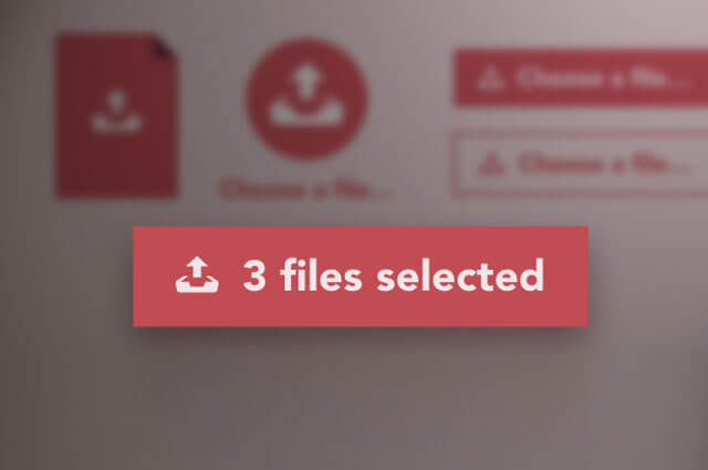
Probably and hopefully the last thing missing is indicating if files were selected. The file input does usually indicate that, but in our case the input is visually hidden. Luckily, there is a way out: a tiny JavaScript enhancement. The text of a label becomes the name of the selected file. If there were multiple files selected, the text will tell us how many of them were selected.
1 | <input type=<span class="hljs-string">"file"</span> name=<span class="hljs-string">"file"</span> id=<span class="hljs-string">"file"</span> <span class="hljs-class"><span class="hljs-keyword">class</span></span>=<span class="hljs-string">"inputfile"</span> data-multiple-caption=<span class="hljs-string">"{count} files selected"</span> multiple /> |
1 2 3 4 5 6 7 8 9 10 11 12 13 14 15 16 17 18 19 20 | <span class="hljs-keyword">var</span> inputs = <span class="hljs-built_in">document</span>.querySelectorAll( <span class="hljs-string">'.inputfile'</span> ); <span class="hljs-built_in">Array</span>.prototype.forEach.call( inputs, <span class="hljs-function"><span class="hljs-keyword">function</span><span class="hljs-params">( input )</span> </span>{ <span class="hljs-keyword">var</span> label = input.nextElementSibling, labelVal = label.innerHTML; input.addEventListener( <span class="hljs-string">'change'</span>, <span class="hljs-function"><span class="hljs-keyword">function</span><span class="hljs-params">( e )</span> </span>{ <span class="hljs-keyword">var</span> fileName = <span class="hljs-string">''</span>; <span class="hljs-keyword">if</span>( <span class="hljs-keyword">this</span>.files && <span class="hljs-keyword">this</span>.files.length > <span class="hljs-number">1</span> ) fileName = ( <span class="hljs-keyword">this</span>.getAttribute( <span class="hljs-string">'data-multiple-caption'</span> ) || <span class="hljs-string">''</span> ).replace( <span class="hljs-string">'{count}'</span>, <span class="hljs-keyword">this</span>.files.length ); <span class="hljs-keyword">else</span> fileName = e.target.value.split( <span class="hljs-string">'\\'</span> ).pop(); <span class="hljs-keyword">if</span>( fileName ) label.querySelector( <span class="hljs-string">'span'</span> ).innerHTML = fileName; <span class="hljs-keyword">else</span> label.innerHTML = labelVal; }); }); |
There is also a jQuery version of this code presented in the source of the demo files. Make sure to check them out.
A little explanation:
- Having the native
[multiple]attribute allows users to select more than one file per upload. Whereas[data-multiple-caption]is a fictive attribute for expressing the message if multiple files were selected. Here you can set a custom message. The use of the{count}phrase is optional and the fragment is replaced with the number of files selected. The reason I use an additional HTML attribute instead of assigning this sentence as a value for a JavaScript variable is because it’s much easier to maintain the copy when it is in one place. - HTML attribute
[multiple]is not supported in IE 9 and below and neither is thefilesproperty of JavaScript. For the latter case, we simply rely onvalue. Since it usually has a value ofC:\fakepath\filename.jpgformat, thesplit( '\\' ).pop()extracts what’s actual – the name of the file. - An interesting thing is that you can unset a value of the input by pressing the ESC button while in the file browser. This is possible only in Chrome and Opera. Therefore, we use
labelValfor storing the default value of the label and bringing it back when necessary.
This is how the final result looks like:

What if JavaScript is not available?
Since there is no JavaScript-less way to indicate if any files were selected, it would be better to rely on the default looks of the file input for the sake of usability. All we need to do is to add a .no-js class name to the <html> element and then use JavaScript and replace it with .js – that’s how we will know if JavaScript is available.
1 2 3 4 5 6 | <span class="hljs-tag"><<span class="hljs-title">html</span> <span class="hljs-attribute">class</span>=<span class="hljs-value">"no-js"</span>></span> <span class="hljs-tag"><<span class="hljs-title">head</span>></span> <span class="hljs-comment"><!-- remove this if you use Modernizr --></span> <span class="hljs-tag"><<span class="hljs-title">script</span>></span><span class="javascript">(<span class="hljs-function"><span class="hljs-keyword">function</span><span class="hljs-params">(e,t,n)</span></span>{<span class="hljs-keyword">var</span> r=e.querySelectorAll(<span class="hljs-string">"html"</span>)[<span class="hljs-number">0</span>];r.className=r.className.replace(<span class="hljs-regexp">/(^|\s)no-js(\s|$)/</span>,<span class="hljs-string">"$1js$2"</span>)})(<span class="hljs-built_in">document</span>,<span class="hljs-built_in">window</span>,<span class="hljs-number">0</span>);</span><span class="hljs-tag"></<span class="hljs-title">script</span>></span> <span class="hljs-tag"></<span class="hljs-title">head</span>></span> <span class="hljs-tag"></<span class="hljs-title">html</span>></span> |
The CSS part accordingly:
1 2 3 4 5 6 7 8 9 10 11 12 | <span class="hljs-class">.js</span> <span class="hljs-class">.inputfile</span> <span class="hljs-rules">{ <span class="hljs-rule"><span class="hljs-attribute">width</span>:<span class="hljs-value"> <span class="hljs-number">0.1px</span></span></span>; <span class="hljs-rule"><span class="hljs-attribute">height</span>:<span class="hljs-value"> <span class="hljs-number">0.1px</span></span></span>; <span class="hljs-rule"><span class="hljs-attribute">opacity</span>:<span class="hljs-value"> <span class="hljs-number">0</span></span></span>; <span class="hljs-rule"><span class="hljs-attribute">overflow</span>:<span class="hljs-value"> hidden</span></span>; <span class="hljs-rule"><span class="hljs-attribute">position</span>:<span class="hljs-value"> absolute</span></span>; <span class="hljs-rule"><span class="hljs-attribute">z-index</span>:<span class="hljs-value"> -<span class="hljs-number">1</span></span></span>; <span class="hljs-rule">}</span></span> <span class="hljs-class">.no-js</span> <span class="hljs-class">.inputfile</span> + <span class="hljs-tag">label</span> <span class="hljs-rules">{ <span class="hljs-rule"><span class="hljs-attribute">display</span>:<span class="hljs-value"> none</span></span>; <span class="hljs-rule">}</span></span> |

Firefox Bug
It is quite unexpected that Firefox completely ignores the input[type="file"]:focus expression, whereas :hover and :active work just fine! Surprisingly, Firefox allows to catch the focus event in JavaScript, so the workaround is adding a class to the file input element that let’s us control the focus style:
1 2 | input.addEventListener( <span class="hljs-string">'focus'</span>, <span class="hljs-function"><span class="hljs-keyword">function</span><span class="hljs-params">()</span></span>{ input.classList.add( <span class="hljs-string">'has-focus'</span> ); }); input.addEventListener( <span class="hljs-string">'blur'</span>, <span class="hljs-function"><span class="hljs-keyword">function</span><span class="hljs-params">()</span></span>{ input.classList.remove( <span class="hljs-string">'has-focus'</span> ); }); |
1 2 3 4 5 | <span class="hljs-class">.inputfile</span><span class="hljs-pseudo">:focus</span> + <span class="hljs-tag">label</span>, <span class="hljs-class">.inputfile</span><span class="hljs-class">.has-focus</span> + <span class="hljs-tag">label</span> <span class="hljs-rules">{ <span class="hljs-rule"><span class="hljs-attribute">outline</span>:<span class="hljs-value"> <span class="hljs-number">1px</span> dotted <span class="hljs-hexcolor">#000</span></span></span>; <span class="hljs-rule"><span class="hljs-attribute">outline</span>:<span class="hljs-value"> -webkit-focus-ring-color auto <span class="hljs-number">5px</span></span></span>; <span class="hljs-rule">}</span></span> |
Check out the example styles in the demo to see how to style the file input element according to your needs. Make sure to take a look at the source code of the demo and feel free to use this technique in your projects. Happy uploading!


 by
by 

