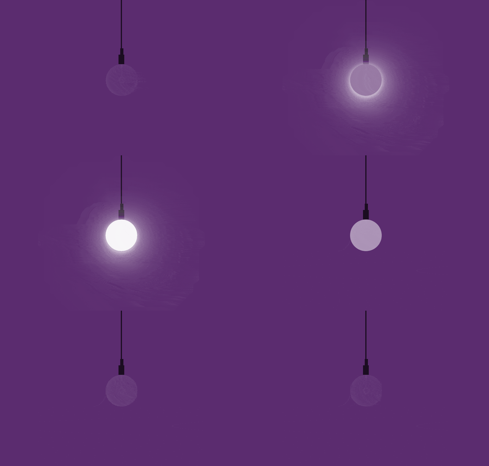
Hello friend today with this article I am going to share with you a very beautiful Lamp On Off Animation Using CSS. Here you will get a Lamp and a button when you click on button Lamp will open and close.
It is a just like a game as we play with our siblings to on off the bulb using switch same here I am using a hidden checkbox operating threw a label where whenever we click on Label Off lamp or Bulb will be Animate to brighter that means lamp is on now and again when we click its gone off shade of light that means it is off now.
This bulb on off animation is a repetitive process on each click.
Before proceeding to coding part I would like to share with you my last two awesome article that will definitely blow your mind by their effect.
Please this out here as link given below:
So now lets start coding for this bulb on/off animation using css:
HTML Structure:
|
1 2 3 4 5 6 7 8 |
<div id="lamp"> <input type="radio" name="switch" value="on" /> <input type="radio" name="switch" value="off" checked="checked"/> <label for="switch" class="entypo-lamp"></label> <div class="lamp"> <div class="gonna-give-light"></div> </div> </div> |
CSS Stylsheet:
|
1 2 3 4 5 6 7 8 9 10 11 12 13 14 15 16 17 18 19 20 21 22 23 24 25 26 27 28 29 30 31 32 33 34 35 36 37 38 39 40 41 42 43 44 45 46 47 48 49 50 51 52 53 54 55 56 57 58 59 60 61 62 63 64 65 66 67 68 69 70 71 72 73 74 75 76 77 78 79 80 81 82 83 84 85 86 87 88 89 90 91 92 93 94 95 96 97 98 99 100 101 102 103 104 105 106 |
@import url(http://weloveiconfonts.com/api/?family=entypo); *, *:before, *:after { margin:0; padding:0; -webkit-box-sizing:border-box; -moz-box-sizing:border-box; box-sizing:border-box; } #lamp { position:relative; width:100vw; height:100vh; overflow:hidden; } input[name="switch"], input[name="switch"] + label { position:absolute; bottom:3rem; width:4rem; height:4rem; } input[name="switch"] + label {right:3rem;} input[name="switch"] { opacity:0; z-index:9; cursor:pointer; } input[value="on"] { right:3rem; } input[value="off"] { right:-4rem; } input[name="switch"] + label { text-align:center; } [class*="entypo-"]:before { line-height:4rem; font-size:2.5rem; color:rgba(255,255,255,0.4); font-family:'entypo', sans-serif; } input[value="on"]:checked { right:-4rem; } input[value="on"]:checked + input[value="off"] { right:3rem; } .lamp { position:relative; margin:0 auto; width:.7rem; height:10rem; background-image:linear-gradient(rgba(0,0,0,0.7), rgba(0,0,0,0.7)), linear-gradient(rgba(0,0,0,0.7), rgba(0,0,0,0.7)), linear-gradient(rgba(0,0,0,0.7), rgba(0,0,0,0.7)); background-repeat:no-repeat; background-size:.15rem 8rem, .4rem .8rem, .7rem 2rem; background-position:50% 0, .19rem 8rem, 0 8.8rem; } .lamp:before, .lamp:after { content:''; position:absolute; } .lamp:before { left:-1.65rem; bottom:-4rem; width:4rem; height:4rem; border-radius:50%; background:rgba(255,255,255,0.03); box-shadow:inset 2px -2px 10px rgba(255,255,255,0.07); transition:all .15s; } .gonna-give-light, .gonna-give-light:before{ position:absolute; } .gonna-give-light { top:10.05rem; left:.25rem; width:0; height:1.5rem; border-right:.2rem solid rgba(255,255,255,0.05); } .gonna-give-light:before { content:''; top:1.5rem; left:-.35rem; width:.9rem; height:.9rem; border-radius:50%; border:.2rem solid rgba(255,255,255,0.05); box-shadow:0px 0px 50px rgba(255,255,255,0); } input[value="on"]:checked ~ .lamp:before { background:rgba(255,255,255,1); box-shadow:0px 2px 10px rgba(255,255,255,0.8), 0px 5px 50px rgba(255,255,255,0.8), 0px 8px 80px rgba(255,255,255,0.6), 0px 8px 120px rgba(255,255,255,0.6); } body {background:#2f323c;} html, body { width:100%; height:100%; } |

