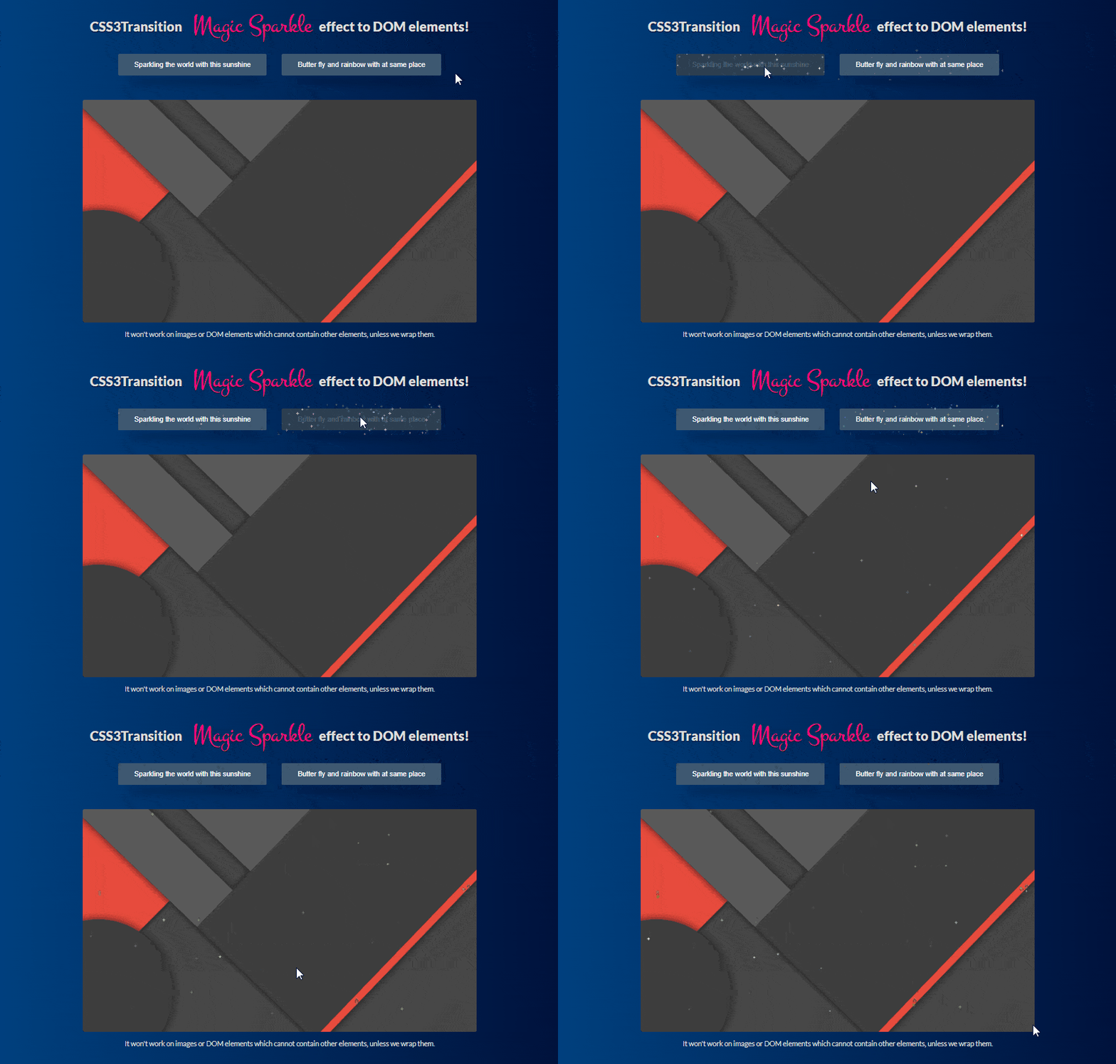
Hi All, today I will share a different kind of Article till date I have shared , it is a Magic Sparkle Effect using jQuery and Canvas effect. Where in previous article I have shared with you two amazing article which is got many complements from you guys, they are basically html Login and Sign up form Toggle Animation differently using advance css and jquery the first was Toggle Animation In Between Login And Sign Up Form and the second html login and registration form is Material Design Login Form Animation, hope you love to see it again.
Lets start some briefing about this article, in this article you will see magic sparkle animation or you can say it is a sparkle effect using jQuery on canvas. When you hover on any text or element it will appear like sparkle effect on it. There are two kind of sparkle effect are showing, first is colorfull sparkle animation and another one is white and silver sparkle animation both will appear on hover.
This is a very cute sparkle effect jquery plugin can be created on any dom element.
Now lets Code it:
First of i will let you know all the required files whatever it is css and jquery by including it in header portion:
Use these codes before header closing tag
|
1 2 3 4 5 6 7 8 9 10 11 12 13 14 15 16 17 18 19 20 21 22 23 24 25 26 27 28 29 30 31 32 33 34 35 36 37 38 39 40 41 42 43 44 45 46 47 48 49 50 51 52 53 54 55 56 57 58 59 60 61 62 63 64 65 66 67 68 69 70 71 72 73 74 75 76 |
<script src="https://s.codepen.io/assets/libs/modernizr.js" type="text/javascript"></script> <link rel="stylesheet" href="https://cdnjs.cloudflare.com/ajax/libs/normalize/5.0.0/normalize.min.css"> <style> /* NOTE: The styles were added inline because Prefixfree needs access to your styles and they must be inlined if they are on local disk! */ @import url(https://fonts.googleapis.com/css?family=Lato:400,900|Montez); .sparkley { background: #3e5871; color: white; border: none; padding: 16px 36px; font-weight: normal; border-radius: 3px; transition: all 0.25s ease; box-shadow: 0 38px 32px -23px black; margin: 0 1em 1em; } .sparkley:hover { background: #2c3e50; color: rgba(255, 255, 255, 0.2); } html { font-family: Lato; font-weight: 200; font-size: 1em; text-align: center; color: #ddd; min-height: 100%; background: #092756; background: #000428; /* fallback for old browsers */ background: -webkit-linear-gradient(to right, #004e92, #000428); /* Chrome 10-25, Safari 5.1-6 */ background: linear-gradient(to right, #004e92, #000428); /* W3C, IE 10+/ Edge, Firefox 16+, Chrome 26+, Opera 12+, Safari 7+ */ } html body { padding: 50px; } h1 span, h2 span, h3 span { font-family: Montez; font-size: 1.9em; font-weight: 300; margin: 0 0.3em; color: #ff0080; } h1 { font-size: 1.9em; width: 900px; margin: 0 auto 1em; text-shadow: 0 2px 1px black; } .img { margin: 40px auto 0; width: 900px; display: block; } .img img { width: 100%; border-radius: 5px; } p { padding: 5px 10px; display: inline-block; margin: 10px auto; } </style> <script src="https://cdnjs.cloudflare.com/ajax/libs/prefixfree/1.0.7/prefixfree.min.js"></script> |
Markup Code(HTML):
|
1 2 3 4 5 6 7 8 9 10 |
<h1>CSS3Transition <span>Magic Sparkle</span>effect to DOM elements!</h1> <button class="sparkley">Sparkling the world with this sunshine</button> <button class="sparkley last">Butter fly and rainbow with at same place</button> <div class="img"> <img id="image" src="images/material-design.jpg"> </div> <p>It won't work on images or DOM elements which cannot contain other elements, unless we wrap them.</p> |
please include given code before body closing tag </body>
|
1 2 3 4 |
<script src='http://cdnjs.cloudflare.com/ajax/libs/jquery/2.1.3/jquery.min.js'></script> <script src='js/rbeix.js'></script> <script src="js/index.js"></script> |
For more details please download the code or see Example

