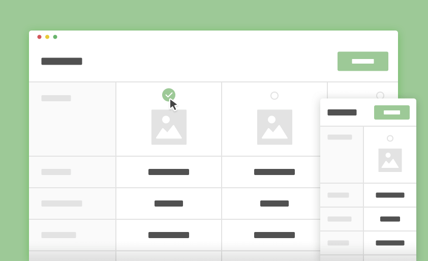
A responsive product comparision table to compare and filter through multiple products.
If you are developing a online store where you want to no of product to be store, in this scenirioa you will require this product/ plugin with your store. Here we are following a very simple approach in which I will use a simple HTML table element. it will be very helpful in case if you want to compare 6+ product this thing get tricky particular when you want whole things in responsive view.
Today, threw this article you can save your time bye using this time-saver comparison table. It is truly design for big online product store. It is already installed with SONY UK WEKSITE. In UX term we are here letting user select and filter item as you want to compare or filter.
Creating the structure
The HTML structure is combination of a section.cd-products-comparison-table having a <header> and a div.cd-products-table. The <header> include the action buttons (filter and reset) while the div.cd-products-table is used to wrap the div.features(product features list) and the div.cd-products-wrapper. The latter contains an unordered list (ul.cd-products-columns) for the product list items.
|
1 2 3 4 5 6 7 8 9 10 11 12 13 14 15 16 17 18 19 20 21 22 23 24 25 26 27 28 29 30 31 32 33 34 35 36 37 38 39 40 41 42 43 44 45 46 47 48 49 50 51 52 |
<section class="cd-products-comparison-table"> <header> <h2>Compare Models</h2> <div class="actions"> <a href="#0" class="reset">Reset</a> <a href="#0" class="filter">Filter</a> </div> </header> <div class="cd-products-table"> <div class="features"> <div class="top-info">Models</div> <ul class="cd-features-list"> <li>Price</li> <li>Customer Rating</li> <li>Resolution</li> <!-- other features here --> </ul> </div> <!-- .features --> <div class="cd-products-wrapper"> <ul class="cd-products-columns"> <li class="product"> <div class="top-info"> <div class="check"></div> <img src="../img/product.png" alt="product image"> <h3>Sumsung Series 6 J6300</h3> </div> <!-- .top-info --> <ul class="cd-features-list"> <li>$600</li> <li class="rate"><span>5/5</span></li> <li>1080p</li> <!-- other values here --> </ul> </li> <!-- .product --> <li class="product"> <!-- product content here --> </li> <!-- .product --> <!-- other products here --> </ul> <!-- .cd-products-columns --> </div> <!-- .cd-products-wrapper --> <ul class="cd-table-navigation"> <li><a href="#0" class="prev inactive">Prev</a></li> <li><a href="#0" class="next">Next</a></li> </ul> </div> <!-- .cd-products-table --> </section> <!-- .cd-products-comparison-table --> |
Adding style
The .cd-products-wrapper has a width of 100% and overflow-x of auto; the .cd-products-columns, instead, has a width equal to the sum of all columns widths and is scrollable (because of its parent overflow property). The div.features has an absolute position and is fixed on the left side of the viewport.
|
1 2 3 4 5 6 7 8 9 10 11 12 13 14 15 16 17 18 19 20 |
.cd-products-wrapper { overflow-x: auto; /* this fixes the buggy scrolling on webkit browsers - mobile devices only - when overflow property is applied */ -webkit-overflow-scrolling: touch; } .cd-products-table .features { /* fixed left column - product properties list */ position: absolute; z-index: 1; top: 0; left: 0; width: 120px; } .cd-products-columns { /* products list wrapper */ width: 1200px; /* single column width * products number */ margin-left: 120px; /* .features width */ } |
On big devices (viewport width greater than 1170px), the .top-fixed class is added to the .cd-products-table when user scrolls down to fix the products top information (product name and image):
|
1 2 3 4 5 6 7 8 9 10 11 12 13 14 15 16 17 18 19 20 |
@media only screen and (min-width: 1170px) { .cd-products-table.top-fixed .cd-products-columns > li { padding-top: 160px; } .cd-products-table.top-fixed .top-info { height: 160px; position: fixed; top: 0; } .cd-products-table.top-fixed .top-info h3 { transform: translateY(-116px); } .cd-products-table.top-fixed .top-info img { transform: translateY(-62px) scale(0.4); } } |
Events handling
To implement the products table, we created a productsTable object and used the bindEvents function to attach event handlers to the proper elements:
|
1 2 3 4 5 6 7 8 9 10 11 12 13 14 15 16 17 18 19 20 21 22 23 24 25 26 27 28 29 30 31 32 33 34 35 36 37 38 39 40 |
function productsTable( element ) { this.element = element; this.table = this.element.children('.cd-products-table'); this.productsWrapper = this.table.children('.cd-products-wrapper'); this.tableColumns = this.productsWrapper.children('.cd-products-columns'); this.products = this.tableColumns.children('.product'); //additional properties here // bind table events this.bindEvents(); } productsTable.prototype.bindEvents = function() { var self = this; self.productsWrapper.on('scroll', function(){ //detect scroll left inside products table }); self.products.on('click', '.top-info', function(){ //add/remove .selected class to products }); self.filterBtn.on('click', function(event){ //filter products }); //reset product selection self.resetBtn.on('click', function(event){ //reset products visibility }); this.navigation.on('click', 'a', function(event){ //scroll inside products table - left/right arrows }); } var comparisonTables = []; $('.cd-products-comparison-table').each(function(){ //create a productsTable object for each .cd-products-comparison-table comparisonTables.push(new productsTable($(this))); }); |
You may have noticed that we added an event listener to the scroll event of the .cd-products-wrapper; when the .top-fixed class is added to the .cd-products-table, the .top-info elements are in fixed position, so they don’t scroll with the .cd-products-columns. The updateLeftScrolling() function is used to horizontally translate these elements while the user scrolls inside the .cd-products-wrapper.
|
1 2 3 4 5 |
productsTable.prototype.updateLeftScrolling = function() { var scrollLeft = this.productsWrapper.scrollLeft(); if( this.table.hasClass('top-fixed') && checkMQ() == 'desktop') setTranformX(this.productsTopInfo, '-'+scrollLeft); } |

